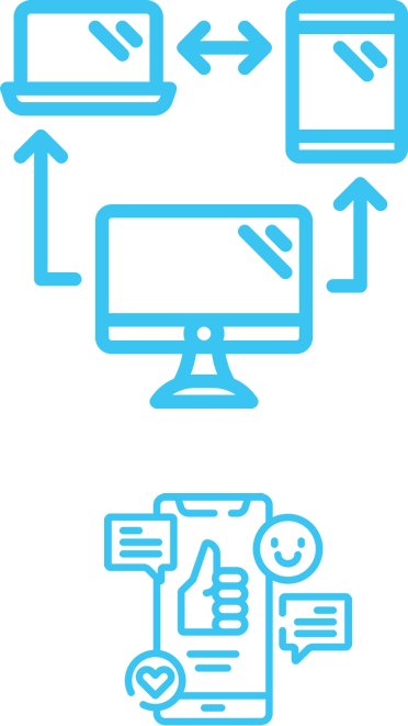
Having your business website on the internet isn’t sufficient anymore: nowadays, a website needs to be accessible and navigable on mobile devices such as Smartphones and tablets.
A responsive design will allow the same website to work on different supports. Widescreen, laptops, desktops, tablets, notebooks, mobiles and Smartphones are amongst the most common devices and they operate on different platforms.
No need to duplicate your website to create a mobile version. We provide mobile compatibility guaranteeing correct display and effectiveness including online stores and social buttons.
How it works?
The responsive design works in relation to the screen size data provided by the device to the website’s server. The website is designed in a way to respond to the size of the device by using CSS3 coding to make the mobile fully responsive.